Article: Sketch London: Life After the Pink Room
Sketch London: Life After the Pink Room
Images are credited where they are not from the Rugberry house.
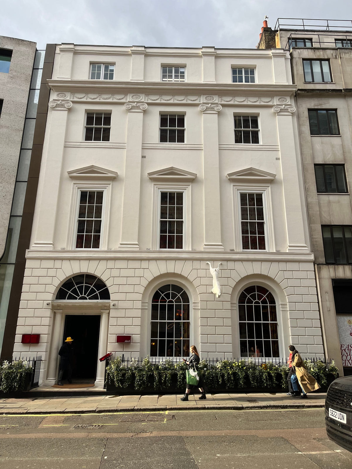
The front of 9 Conduit Street in Mayfair, the eighteenth century house that holds Sketch. Photo: Gbear605, CC BY-SA 3.0, via Wikimedia Commons, licence
For a while it seemed that every second photograph of London on a phone was taken in the same room. Pale pink banquettes ran around the walls. Pink on the seats, pink on the walls, pink in the light, and on top of it all a scatter of black and white drawings by David Shrigley. The Gallery at Sketch, on Conduit Street in Mayfair, had become an Instagram favourite, a room people booked as much to photograph as to eat in. Then it changed, and people still arrive looking for a room that is no longer there.
The pink was chosen by the designer India Mahdavi. By her own account, it outlived its plan. "The pink Gallery at Sketch lasted eight years instead of the two years initially planned," she told Dezeen. That alone is a lesson about colour. A shade picked for a moment became, for nearly a decade, the identity of a restaurant.
Leaving the pink behind
In 2022, to mark the restaurant's 20th year, Mahdavi redesigned the Gallery. The new room is yellow and copper. The banquettes are covered in yellow fabrics and leather, with subtle shades varying from piece to piece in patterns of woven raffia, using fabrics by the Senegalese textile designer Aissa Dione. The walls are lined in metallic copper paper by De Gournay. The wall lights are Ghanaian wicker, made by the artist Inès Bressand. The art changed too: Yinka Shonibare filled the room with Modern Magic, a set of site specific works.
Mahdavi was clear about what she was doing, and why. "I really believe that the pink room belonged to the pre-Covid era," she said. "It was fun, feminine and there was a certain lightness to it." The new room, by contrast, "has more depth, the textures imply the feeling of togetherness." And then the sentence that sums up the shift: "Warmth is the new colour at Sketch."
Read that line twice. Warmth is not a colour. It is a quality that colour, texture and light produce together. By naming it as the new colour, Mahdavi was saying that the room no longer depended on a single shade. It depended on how the surfaces felt.
Warmth is not a colour. It is a quality that colour, texture and light produce together.
Texture over colour
"Textures have transcended colours," Mahdavi said of the redesign. It is a striking claim from a designer famous for colour, and it is the useful heart of the story. The pink room worked as an image. You could recognise it from across a feed in a fraction of a second, because one flat colour was doing all the work. The yellow room works as an experience. Its raffia weaves, its leather, its metallic walls and its wicker lights are things you notice when you are sitting inside, with a glass in your hand, as the evening goes on.
Flat colour photographs beautifully and tires quickly. Texture photographs less dramatically and lasts. A copper wall changes as the light changes, warm at dusk and bright under lamps. A woven seat looks different close up than from the door. The room has more to give the longer you stay, which is exactly what a dining room should do.
There is also a practical intelligence here. Mahdavi described the copper walls and wicker lights as her way of helping Shonibare take over the room without interfering with his work. A textured, warm shell is a better host for art than a loud single colour, because it supports what hangs on it rather than competing.
The pink room had shown the limits of the other approach. Shrigley's black and white drawings stood out sharply against the pale pink, and for a time the pairing was perfect: graphic lines on a soft field, as easy to read on a phone as on the wall. But a room built around one strong colour can only partner a certain kind of art. Hang something warmer, quieter or more textured against that pink and the two would fight. A shell made of texture is more generous. It can take clay, wool, quilts or drawings, and let each one look like itself.
A shell that lets the art move
That idea was tested in January 2026. On 13 January Sketch unveiled new artworks in the Gallery by Jonathan Baldock: 84 clay masks lining the walls, flower sculptures that bloom into faces and bodies around the bar, and large wool cocoons hung from the ceiling. Mahdavi's yellow interior stayed exactly as it was. The art had changed, and the room was new again, without a single banquette being recovered.
The Gallery has always worked this way. Earlier artists shown there include David Shrigley and Martin Creed. More recently, from September into November 2026, Sketch is showing an Art and Design exhibition with Camille Walala. The room is less a fixed design than a stage built to hold a succession of other people's work. The pink version, for all its fame, was perhaps too strong a statement for that role. The yellow one, with its depth and its texture, is better at stepping back.
What a room can learn from a restaurant
Most homes are not restaurants, but the story holds a lesson for them. Colour can make a room famous. It can make a reputation, a photograph, a mood that everyone recognises. What it cannot do on its own is keep a room alive for years. That job belongs to texture and to change: surfaces that reward a closer look, and a few things, art, books, flowers, that can be moved and replaced while the shell stays.
The people who still come to Conduit Street hoping for pink are not wrong to miss it. It was a remarkable room. But the room that replaced it is the better model for anyone furnishing a home. Pick a warm, textured ground that will last. Then let the things on top of it keep moving. At 9 Conduit Street that is exactly what happens: the walls keep passing to new artists, and the yellow room keeps receiving them.
Follow @sketchlondon on Instagram for their own work, in their own words.
Rugberry notes
From the Rugberry house
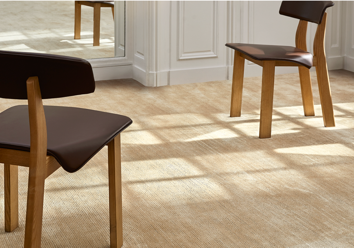
The rugs in these rooms sit on the warm and textured side of the palette: chocolate, camel, ochre and a deep navy. A deep pile in a warm tone works much like a copper wall. It changes with the light, looks richer close up than from across the room, and makes a calm ground for everything that will come and go on top of it.
If that appeals, the Plush Wool Rug in chocolate, handloom woven in New Zealand wool with a deep, quiet pile, and the wider Plush collection work in a similar spirit, with rust and copper rugs for warmth as a colour and textured solid rugs for rooms where the art should change and the floor should stay.


In the Rugberry house
- Plush collectionDeep pile in warm tones that change with the light.
- Rust and copper rugsWarmth as a colour, underfoot.
- Textured solid rugsA calm ground for things that move.
Rugberry has no affiliation with the studios featured. Images are from the Rugberry house unless credited.