At Bar Luce, Wes Anderson Built a Room Instead of a Set
Images are credited where they are not from the Rugberry house.
The floor is pink terrazzo, speckled with flashes of red, grey and white. The chairs are formica in bubblegum pink and powder blue. Overhead, a vaulted ceiling has been papered to look like a tiny glass arcade, and two rows of spherical lamps hang down the length of the room. In the corner a jukebox waits, and beside it two pinball machines. At the counter an old Faema machine hisses. It looks like a film set. The man who designed it insists that it is the opposite of one.
Bar Luce opened in 2015 in the entrance building of Fondazione Prada in Milan, designed by the film director Wes Anderson to recreate the atmosphere of a typical Milanese cafe. It is one of the most photographed rooms in the city, and on any given afternoon a good share of the people inside are holding up a phone. Which makes the director's own description of it all the more interesting.
A set without a camera
Anderson's films are famous for their composition. Rooms are seen dead on, symmetrical, every object placed for a single camera position. You might expect a bar by the same hand to work the same way, with one perfect viewpoint and everything arranged to serve it. Anderson said he did the reverse. His approach to Bar Luce was the opposite of film set design, and there are no ideal angles from which to see it.
"It is for real life, and ought to have numerous good spots for eating, drinking, talking, reading," he told Dezeen when it opened. He went further: "While I do think it would make a pretty good movie set, I think it would be an even better place to write a movie." And then, most simply: "I tried to make it a bar I would want to spend my own non-fictional afternoons in." Fondazione Prada reports a similar test in his words, a bar you would want to go to five times a week. He added that as a boy he had wanted to be an architect, and called the chance "to pretend to be a real one" a childhood fantasy come true.
That ambition changes how the room has to be built. A set only has to survive the shoot. A bar has to survive thousands of mornings of coffee cups, wet umbrellas and chairs dragged across the floor. Every pretty surface in Bar Luce has a second job, which is to be tough.
Milan, remembered in miniature
The references are local and specific. The arched ceiling and its patterned paper recreate, in miniature, the vaulted glass roof of the Galleria Vittorio Emanuele II, the city's grand shopping arcade. More paper above the wooden wall panels recalls the windows and balconies of that building. The formica furniture, the floor and the veneered panelling echo the Italian popular aesthetic of the 1950s and 1960s, the era of the neighbourhood bar the room sets out to remember.
There is a sly humour in the details. The pinball machines are themed on two of Anderson's own works, The Life Aquatic and Castello Cavalcanti. A teal clock keeps time on the wall. And the bar has its own door onto Via Orobia, so it can open outside gallery hours and serve the neighbourhood rather than only the museum.
A set only has to survive the shoot. A bar has to survive thousands of mornings of coffee cups, wet umbrellas and chairs dragged across the floor.
Why pastel works here
Pastel interiors have a reputation for fragility. Powder blue and shell pink suggest rooms nobody actually uses, colours chosen for photographs rather than for life. Bar Luce argues against that reputation, and the argument rests on material. Formica is one of the most forgiving surfaces ever made. Terrazzo is stone, and its scatter of chips hides crumbs and footprints. Veneered wood takes knocks and gains character from them.
Put soft colour on hard surfaces and it stops being precious. The pink is not a delicate pink when it is set in stone; it is a pink that will be walked on for decades. The blue chairs can be wiped down every hour. The room is sweet to look at and hard wearing to live in, which is exactly the combination most homes need and rarely achieve.
Pattern helps too. The speckled floor and the patterned ceiling break up the surfaces so that wear and dirt have somewhere to hide. A flat expanse of pale colour shows every mark. A flecked or patterned one absorbs them. It is the same principle that lets a busy family keep a patterned rug looking good for years while a plain pale one looks tired in a season.
Then there is the light. Two long rows of round lamps give the whole room the same soft glow, with no dramatic pools and no dark corners. It is cafe lighting rather than stage lighting, designed for reading a newspaper at the far table as easily as at the counter. Cinema lights a face. A bar lights a room full of them, at every hour, and the even glow is part of why every seat feels like a good one. Pastel colour needs that kind of light. Under a spotlight it turns sugary; under an even wash it simply looks warm.
The photograph and the afternoon
Bar Luce carries a tension it never quite resolves, and perhaps should not. It was built to be lived in, and it is endlessly photographed. Its success as an image may be the thing that makes it hardest to use as a bar on a busy weekend. Anderson cannot control that, and the room is better for having been designed as if he could ignore it.
The lesson travels well beyond Milan. A room designed for one perfect photograph tends to look worse every day after the photograph is taken. A room designed for ordinary afternoons, with many good spots rather than one, tends to look better as it fills with life. Colour can be as confident as you like, provided the surfaces underneath it are ready for real use. The pink can be bubblegum. The floor just has to be terrazzo.
Follow @fondazioneprada on Instagram for their own work, in their own words.
Rugberry notes
From the Rugberry house
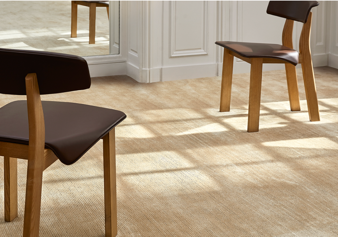
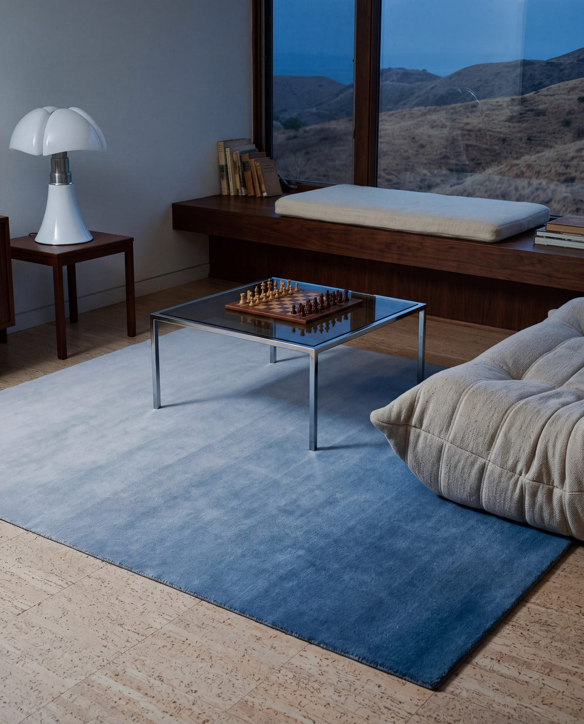
The bar's lesson about colour carries straight onto a floor: soft blues and quiet patterns that are meant to be walked on, not admired from the door. A wool pile behaves like terrazzo in this respect. It hides the small marks of daily life in its texture and springs back after it is pressed, so a confident colour stays confident.
If that appeals, our blue rugs and pattern rugs work in a similar register, with modern rugs for rooms that want colour with clean lines.


In the Rugberry house
- Blue rugsSoft blues made to be walked on.
- Pattern rugsPattern that hides the marks of daily life.
- Modern rugsConfident colour with clean lines.
Rugberry has no affiliation with the studios featured. Images are from the Rugberry house unless credited.